This contents page focuses on the genre Hip Hop and portrays it accordingly. Firstly it holds the regular connotations of Vibe Magazine, it has the image of the ‘V’ emerging from the background, the usual layout of the word ‘contents and finally the logo in the top right corner, these all just reference magazine in general. The main image is of a rapper posing topless putting his excessive amounts of jewellery on show, the pose is a portrayal of the artists’ individual confidence and the jewellery represents the glamorous lifestyle stereotypically attached to a successful rappers life style. The fact that the other subtitles and text are white breaks through the red making them bold and easily accessible against the background.
Monday, 20 February 2012
Textual Analysis: Vibe Contents Page
This is the contents page of Vibe magazine a popular magazine that highlights its main genres as Hip Hop and RnB, two urban genres, its target audience would be the younger generation. Firstly the masthead on this page is the word ‘contents’ split up into three sections dominating the right side of page this is typical of all vibe magazines. The fact that this text is in white again the dark background draws the consumer straight to text meaning they will read on. The minimal text on the page only features four of the articles present in the magazine meaning that in order for the consumer to obtain the full experience of the magazine they must buy the magazine and read on which is a good strategy to sell magazines and keep consumers reading. The use of colours and fonts for the text on this page other than the masthead is black and the style of writing is not bold nor is it clear at first glance this pushes the consumer to focus and make an effort to read all the information on the page as it is not clear at first glance. The main image on the page is off well know RnB artist Ciara who is lying on her back with her legs taking the form of a ‘v’ which represents the title of the magazine (vibe). The image also has factors of the stereotypical views of Hip Hop and RnB when it comes to females as the image has the portrayal of sex appeal due to the featuring outfit and body language.
Textual Analysis of Billboard Magazine!
This edition of Billboard magazine captures Rihanna as their main feature artist going straight to the main cover line ‘Rihanna....my fans don’t really know me’ the deductions of her being a mystery runs through the whole theme of this front cover. The background and the main image capture the feeling of mystery and revelation this can be said as the artist seems to be put in a spotlight and is staring straight at the camera this against the dark black background has the connotations of bringing her out of her unknown status and shedding light on her true character linking it back to the main cover line on the front page. The main image also consists of the artist with bold red hair symbolic of passion and pain up against the purity of the cream outfit she is wearing these all begin make the consumer question the background of the artists making the front cover interesting and allowing the text and the picture to be relevant. The other cover lines on the front cover are written in black on a white box again referencing the theme of un covering stories with light.
This front cover is an example of a visually effective cover due to the fact that it has clear links to the story and had a clear and simple layout making it easy to access by consumers that may or may not know who the main cover story is about.
Textual Analysis of Billboard Magazine!
Billboard is an internationally recognised magazine that doesn’t hold any specific genre so acts as a universal provider of news from the music industry. The main cover line reads ‘back to run the world Beyonce’; firstly this brings the news of a return and uses intertextuality as her leading single of the returning album is centred around the lyrics ‘who run the world’. The main image captures the artist posing with their head up and their hands on their hips this has the representations of maturity and an air of confidence within the artist referencing their success in the music industry. the colour choices within the main image and the background echo the feeling of maturity due to the fact that they both uses a nude pink with has the connotations of maturity but still presents femininity as it is pink. The additional cover lines all read about positive stories and up and coming events which is shadowed by the use of the colours white and yellow as white is fresh and new and yellow symbolises usually happiness and light, this just reinforces the feeling of positivity on the front cover.
Overall the front cover portrays the message of a positive return to the music industry and is effective to is purpose due to the fact that it holds no reference to specific colours and can be accessible by all audiences.
Textual Analysis of Vibe Magazine!
Vibe magazine is a popular magazine that covers the Hip Hop and RnB genre. This front cover has the focus on the dominating artist Beyonce and her importance is exaggerated at first glance due to both her name in the main cover line and the size of her picture positioned in the centre of the page. The masthead and cover lines are strategically black and red as these are colours commonly used in association with the connected genres. The font is block and rectangle which presents the text as rather masculine and attracts a wider male audience although the main article is about a female. This links in with the contents of the main image as it shows Beyonce in a revealing outfit this is effective as firstly it will attract Beyonce’s regular audience which is dominated by women but with the added factor of ‘sex appeal’ the magazine cover will draw in a wider audience base in the form of males.
Overall this magazine uses delicate sex appeal to entice consumers this can be said due to textual references such as ‘Beyonce strips down’ and ‘B like you’ve never seen her’ these both leave room for a and begins to make the consumer ask questions in c own heads. It is an effective cover because it reinforces the stereotypes of Hip Hop and RnB with the colours and masculine fonts but at the same time the connotations of the cover as a whole presents a diverse natures attracting different consumers.
Textual analysis of XXL Front Cover.
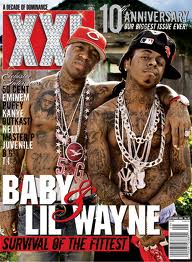
XXL is a widely recognised Hip Hop magazine on this front cover that featured ‘Baby and Lil Wayne’ had specific links to its primary genre as they are two dominating well known artists. Firstly focusing the masthead that had been studded with diamonds, this simultaneously with the jewellery presented on the rappers conveys the luxurious ‘bling’ lifestyle that is stereotypically attached to a hip hop lifestyle. There is a textual link between the puff line ‘a decade of dominance’ symbolic of the magazines ongoing success and then the cover lines listing ten major artists of the hip hop industry boosting the successes of the music industry. The main image on the front cover shows two well known rappers standing topless side by side with high chests and tilted heads. This pose and bodily posture have the connotations of confidence and camaraderie implying hip hop is a big and powerful presence in the industry of music and suggest a link between the two artists, as this magazine would appeal to a specific audience the consumers would know the link is their music label. The powerful main image has a noticeable contrast to the background image of a less glam and money driven area this contrast highlights the ‘grounded’ nature the two rappers are trying to give off and the fact that with their rise to fame they haven’t forgot where they started effectively providing them with a better connection to their audiences. Finally looking at the colour scheme of the front cover it uses mainly reds, blacks and white. The colour red has the deductions of a power and passion again relevant to the hip hop nature. Overall this magazine cover proves to be effective to its specific target audience, this can be said as in order to understand the connotations of the cover in full affect you would have to have an interest and knowledge of its specific genre.
Subscribe to:
Posts (Atom)