Thursday, 26 April 2012
Tuesday, 24 April 2012


Thursday, 12 April 2012
How did you attact your audience?
As my magazine has a specific target audience due to its genre i decided to make the design also specific to my audience and genre. I did this by pinpointing cultural colour that would stand out to the audience to exaggerate its theme and make it eye catching and appealing for my audience. There is also the use of language techniques boldly used on the front cover of the magazine ‘Bajans R De best’ this as a technique again allows the magazine to relate to my audience again allowing them to see my magazine as something they would want. There are also key images throughout the magazine that appeal to both male and female audiences, this can be said due to the fact that the model is pretty and appealing whilst at the same time looking natural and not to overdone. My magazine also documents on cultural events that have significance to my audience allowing my magazine to be seen as not only a music magazine but a source of information.
How does your media product represent particular social groups?
Pressure is a Soca magazine aimed at an audience that are both male and female that are aged 16 to 25. Although my target audience is fairly young my magazine goes against the stereotypical views of people at this age. It promotes a more sophisticated view on music whilst at the same time including the correct types of information such as album charts, new artists and party information to attract the right kind of audiences and keep them interested.

Monday, 12 March 2012
Teacher Feedback
Kharis, please ensure last week's targets are met in addition to:
Targets: 1) Upload evidence of your magazine work in progress with commentary
2) Complete draft front cover and contents page by 16/03/12
Targets: 1) Upload evidence of your magazine work in progress with commentary
2) Complete draft front cover and contents page by 16/03/12
Saturday, 3 March 2012
Teacher Feedback
Kharis you have completed a good range of textual analysis tasks, showing a sound understanding of the key features of music magazines. In addition your quantitative audience research is well presented. A good improvement!
Targets: 1) Upload your vox pops and upload your preliminary task as a separate item
2) Stay on top of the production work by making use of the after school workshops
Targets: 1) Upload your vox pops and upload your preliminary task as a separate item
2) Stay on top of the production work by making use of the after school workshops
Monday, 20 February 2012
Textual Analysis: Q double page spread!
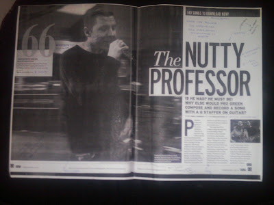
The main article in the Q magazine features artist Professor Green who is an up and coming rapper. The magazine uses presentational devices such as the visual link between the size of both the heading ‘the nutty professor’ and the main image of the artist, this link becomes suggestive of his dominance in the industry as they both stand out on the page. The phrase ‘nutty professor’ also forms intertextuality as that is the title of a popular movie making the artist accessible to a wider audience. The image itself has the stereotypical connotations of the glamorous rap lifestyle whilst still portraying the grounded nature of the artist, this can be said due to the fact the artist is seen holding a sparkly microphone and has a number of visible tattoos but at the same time has not gone for a glam photo shoot and has chosen to be pictured in his natural environment. The theme of a grounded nature is then again confirmed when the colour scheme comes into focus when beginning to focus on the colour scheme used by the magazine produces, they have chosen to use quite earthy and natural colour tones. The typography for this article and throughout the whole magazine is simple, clean and sophisticated communicating the consistency of the magazine and the features within it.
Overall this article presents an artist in their natural habitat and due to the grounded nature of the article it breaks the barriers between the audience and the artist make the artist likability factor a lot higher.
Textual Analysis: Kerrang double page spread!

This double page spread from Kerrang straight away presents a rock feel with the colours black and red as they are regularly uses to represent the genre due to their immediate connotations of anger, pain and passion. The overall layout is busy and has quite a few images within the article but they placed in line on the page, contrasting with the usual thoughts associated with the messiness of rock. The masthead is big, bold and spreads over both pages this firstly draws the reader’s attention straight to the mast head and as it is spread across both pages its presents the importance of what it says as it dominates both pages. The font used with the masthead when closely focused on is distorted this is significant due to how the music of this genre sounds and people perceptions of it. The four images featured on the double page spread show the group at work, the fact that they went against having a big photo shoot with glamorous outfits but choose to portray themselves in a natural light grounded at work gives of the feeling that for them it is more about their musical influence and that what they are in the industry for. There is also the factor that the pictures are in black and white as they don’t show colours the pictures still build a boundary between the band and the consumers as we still fully don’t know what they really look like in colour.
Overall i believe that this double page spread is relevant to its genre as it uses the stereo typical connotations of rock and uses them to form an overall judgment of the group shown.
Textual Analysis: Kerrang Contents page!
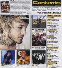
This is the contents of Kerrang magazine a leading heavy metal and rock magazine. The overall layout of the page is very cluttered and busy this could signify the complexity of rock and heavy metal music. The colour scheme throughout the contents page features the colours black and yellow. The black is significant as rock and heavy metal are genres that are presented as dark genres but the fact that yellow is used for the text brings in a contrast as yellow usually symbolises happiness this contrast breaks the stereotypical views and allows a wider audience base to take interest in the page rather than a limited one. There is also the feeling that the page is easy to access because there is clearly the main article portrayed with the biggest main image and the use of the visual links, due to the fact that the images have the page number in the corner. This proves to be a good feature as it helps regular consumers get what they want from the magazine and also acts as guidance for new consumers who may not be as familiar with bands and artists linked to the genre of music.
Overall I believe this contents page fits specifically to its genre with some aspects but then to encourage wider audience to benefit the magazine as they have tried to use universal techniques such as colour.
Subscribe to:
Comments (Atom)