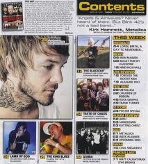
This is the contents of Kerrang magazine a leading heavy metal and rock magazine. The overall layout of the page is very cluttered and busy this could signify the complexity of rock and heavy metal music. The colour scheme throughout the contents page features the colours black and yellow. The black is significant as rock and heavy metal are genres that are presented as dark genres but the fact that yellow is used for the text brings in a contrast as yellow usually symbolises happiness this contrast breaks the stereotypical views and allows a wider audience base to take interest in the page rather than a limited one. There is also the feeling that the page is easy to access because there is clearly the main article portrayed with the biggest main image and the use of the visual links, due to the fact that the images have the page number in the corner. This proves to be a good feature as it helps regular consumers get what they want from the magazine and also acts as guidance for new consumers who may not be as familiar with bands and artists linked to the genre of music.
Overall I believe this contents page fits specifically to its genre with some aspects but then to encourage wider audience to benefit the magazine as they have tried to use universal techniques such as colour.
No comments:
Post a Comment